Buyers from all verticals have moved to viewing and browsing vendor sites on their mobile devices. 42% of B2B buyers use a mobile device for research during the B2B purchasing process. There has been a 91% growth in B2B buyers using smart phones throughout the purchase cycle for their product research.
You have to make the right impression on the mobile site too besides the desktop site. If your site is not designed to render content and images properly on mobile, or if it loads too slow, or is too verbose, users are quick to abandon your website. Your brand suffers as you are judged backward.
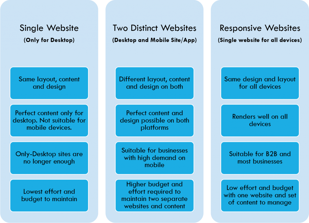
Websites have evolved with the technological advances and the consequential change in user requirements. From an era of a heavy desktop website for all needs, we moved to separate websites for mobile and desktop and to responsive websites which are now par for the course.
Here is a quick round up of the website design and technology options that a business can explore with its set of implications on benefits, effort and cost.
Website and Technology Options for Businesses:
However, even though most businesses now have responsive and mobile sites, many of them don’t plan the content right and as a Marketer, you have some critical decisions to make while planning a responsive or mobile site:
- What content is appropriate and how much content to present on mobile?
- How to write content for Responsive or Mobile sites?
- How to present content and images on mobile in a manner to engage the customer without sacrificing on usability?
To understand the issues in designing and writing content for mobile/ responsive sites, it’s important to understand the challenges.
What are the challenges in designing a website and writing content for mobile devices?
The fact is that mobile and desktop are fundamentally different when it comes to user interaction, people’s usage habits, purpose of use and the amount of information that can be digested in one single glance.
1. Smaller screens:
Not only are the screens smaller in size but the pixels displayed are also fewer than the desktops. The visitors see a lot lesser content in one glance than the desktop sites.
Why are smaller screen so tricky?
Because, visitors can only understand as much as they can see. Unless they get the entire picture in the viewable area, they don’t stick around. Most of the content, thus, needs to appear upfront on the top of the page in an easily readable font with simple layouts, unlike desktops.
2. Screen Orientation:
Mobile screens have a portrait orientation while desktops have landscape. Needless, to say it has a whole lot of design issues and impact on content. For example, a wide image or a table may not be visible fully without losing part of it.
3. Lower Bandwidth:
An average mobile data plan limits the data download and the download rates are much slower than wifi data plans. Heavy websites designed for desktops will be taxing on the bandwidth, will be slow to load, eating up the monthly download limit! Moreover, each second of delay in downloading the page can lead to abandonment.
4. Touchscreens:
Touch-based inputs heavily influence mobile designs. It automatically renders the hover effects or mouse-over events rather useless. Also, the precision of a mouse-pointer is lost with the use of much broader fingers. Hence, clicking the links can become a tedious and make the viewer impatient.
A website showing difficult-to-click links:
5. Decreased keyboard relevance:
Since mobile devices don’t have physical keyboards, it’s rather difficult to key in long text. Of course, touch keyboards for mobile have gotten much better over time but is still out of the comfort zone. Long URLs or long form inputs with extensive keyboard usage will have an impact on the usability.
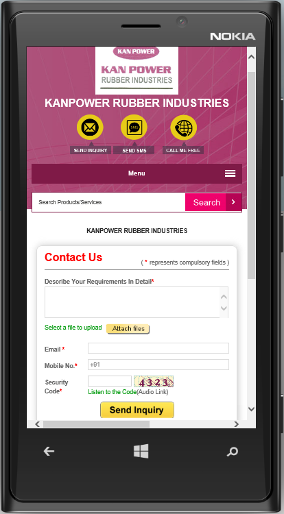
An example of a mobile-optimized contact form and an option to attach your requirements as a file, instead of typing:
6. Habits of mobile users:
Let’s say, in simple terms that mobiles are often used while travelling, walking around, and waiting for somebody. Users can be easily distracted by their surroundings and the informal environment in which they consume content. Therefore content needs strong focus to hold users’ attention.
All the above give us reason enough to realize that content and design for mobile devices deserves special attention.
Following are some key tips and best practices in mobile content and design for,
- Content writing
- Images and tables
- Design
1. Best practices for content writing
The typical golden triangle and F-shaped reading doesn’t hold good anymore. Readers look at the centre and the upper 2/3rds of the mobile screen. Hence, a dedicated design and content for smart phones becomes pertinent.
Here are some content writing tips for mobile devices.
Create short and strong headlines
There is only so much you can see on mobile screens, so, focusing the attention of the users on the most essential content is key. It is always safe to have a strong, short, attention grabbing headline so that it is fully visible on the screen and quickly understood by the user. An interesting and short excerpt following the headline can encourage the visitor to read further.
Create intensely focused content
While it is alright to write long and detailed content for desktops it may be best to keep the content highly focused on one topic of interest. We don’t mean the mobile sites should have shorter articles. What we mean is that it is better to clear the weeds, trim the loose corners and edit the content more strictly to make it intensely focused. Write hard-hitting, well researched and insightful articles will make the readers want to come back for more.
Use shorter paragraphs
Most mobile phones can only hold a few sentences. For mobile users, if it’s out of screen then it’s out of context and out of mind. Remember, we discussed about small screen tricky?
Smaller chunks of data is visible at one glance, easily comprehensible and the user is able to derive the context and relate to it.
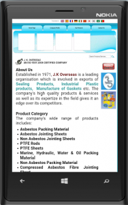
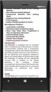
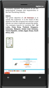
An example of a mobile-optimized content with short paragraphs:
Offer Summaries
If the blog or any other content is too long to read, it is a good idea to offer a landing page for mobile users which will offer summaries of your content pieces. If the user receives tremendous value early on, then they are bound to seek for more and reach out to the redirected page or simply click over to larger articles.
Enhancing the readability
Keep simple, readable, big fonts which will display correctly across all devices and browsers. Keeping the layout simple, with pleasing colour contrasts can keep the user streamlined and focused. Also, no point in showing off your vocabulary and making it difficult to understand. Of course, you need to know your audiences’ preference, but it is best not to use complicated words which are hard to grasp quickly in the first read.
An example of a website which is responsive but fairs poor on readability:
The tabs, content and call-to-action button is not easy to read
Offer visual content
Users are becoming more open to consuming visual content like images, videos, and infographics. Pictures speak a thousand words and when the content is competing vigorously for mobile screen space and user attention, a visual can literally speak a thousand words and more. However, it is important to have mobile optimized visual content so they load perfectly on all the devices.
2. Best practices for images and tables
Images and tables are a great way to communicate with the users.
A table, per se, is very handy in comparing two products, factors or features. It organizes your data and makes it more comprehensible. However, the biggest drawback is that it may not always be mobile-friendly. Tables can be made responsive, however, a big, horizontal table will almost never fit into the mobile screen irrespective of its orientation and thus an important portion of the table may remain hidden from the user. They may lose the context and interest. It is best to avoid using tables or redirect them to the desktop sites where it is easy to view tables.
As for the images it is a good practice to have:
Smaller images
The screen size is to blame for it again! With a small vertical screen space, one cannot expect a huge image to load fully in the screen. If needed, split the images into digestible bites of content which will also display well on the mobile phones.
Responsive images
It is important that the image loads in the appropriate scale and size depending on the devices. If your users are going to download images meant for the desktop then you will sacrifice on the readability and user experience. They should also display consistently across different browser sizes irrespective of their original size.
Responsive images as seen on the mobile screen and desktop:
3. Best practices for design
The challenges mentioned above need to be at the foundation of a mobile website design which will deliver results. Google suggests the following best practices. Now, that’s directly from the horse’s mouth!
Sorting out the navigation issues
- Minimize scrolling and keep it vertical only. Horizontal scroll is an inconvenient feature to have.
- Use a clear hierarchy in menus and avoid rollovers.
- Help customers navigate between levels with clear back and home buttons.
- Use seven links or fewer per page of navigation.
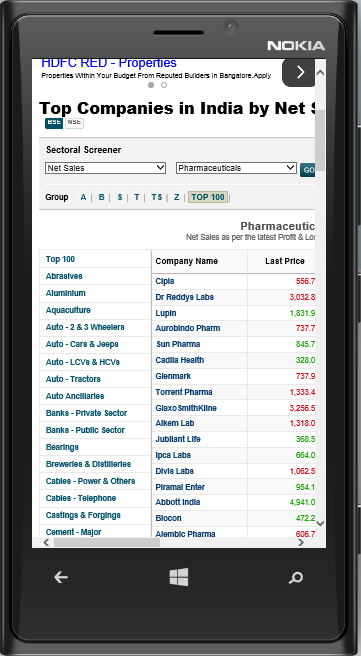
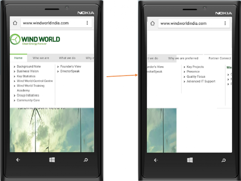
An example of horizontal scrolling on mobile phones:
Optimizing the call-to-action
- The steps needed to complete a transaction should be kept at a bare minimum.
- Keep forms short, with the fewest number of fields possible. (Remember, the keyboard irrelevancy in mobile?)
- Use check boxes, lists, and scroll menus to make data entry easier.
- Use click-to-call functionality for all phone numbers.
Home page
Focus is the key for when it comes to mobile web-design. A homepage on the desktop can act as a welcome page or a promotional page. But, on the mobile, its focus should be on connecting users to the content they’re looking for, rather than being promotional or anything else.
The users have very low attention span and hence the gist of the page should be crisp and delivered quickly. Other do’s are:
- Keep calls-to-action front and center
- Short menus work best
- Coming back to the homepage should never be difficult
Site search
With limited screen space and lack of flexibility to explore the website, a site search becomes increasingly relevant to mobile design to help users find what they are looking for in a jiffy.
- Site search should be clearly visible
- Make the results as relevant as possible by using filters or by guiding the users to better search results
An example of clearly visible site search:
Other design considerations:
Adapting to screen orientation
Though the browsing on a mobile is fundamentally vertical, the screen can get a little wider in the landscape mode of the mobile phones. The design should use a fluid grid layout to adapt to the different screen orientations.
Large clickable buttons
Large buttons on a small screen? With stout, fleshy fingers failing miserably against the mouse pointers in precision, you can easily bet on creating a good user experience by large clickable buttons.
An example of a responsive website with large clickable buttons:
Fixed navigation bars
Fixed navigation bars are a delight on mobile sites as it makes navigation 22% quicker. It could cut 36 seconds off of a five-minute visit to a website. Of course, it reduces the unproductive time in a website session. Think about the positive impact easy navigation would have on your stay-time making the session more productive.
Avoid Flash or Java
Most of the mobile OS do not support flash and/or java, so it’s best to leave it out. Java is also notorious in increasing load times.
Usability
Usability is a natural outcome of good content and design practices. Here are some additional points to enhance usability.
Prioritize the content and features
Mapping your target audiences’ behaviour and requirements will give a fair idea about what content they would like to see and what features suit them most
Optimal site load-time
A site that takes time to load will repel the users. An optimal load time is 2 seconds and anything higher than that increases your bounce rate relatively.
Easy to read
Darker backgrounds, smaller fonts or special font types which is not common to all mobile devices can greatly affect the ease of reading.
Directing the users to full website
Since the mobile sites may not have all the features and content of a content-heavy or huge websites, it is a best practice to let the users choose to navigate to the full website where necessary.
An example of website directing users to the full desktop website:
Pop-ups are a bad idea
It is nothing but an intrusion and your users are not going to like it.
Optimizing the entire site for mobile
Having a website which is partly mobile optimized only makes it harder for the user to browse. The entire site needs to be optimized for mobile to provide a great user experience
Doing away with the pinch-to-zoom method of browsing
A greatest drawback to zooming in and out to read the content or get the context is that the user may miss important call-to-actions. It is advisable to design a site which does not require the user to zoom.
Avoid calls-to-actions launching new window
As far as possible, it is best to keep the calls-to-action in the same page. It is not easy to switch between windows on mobile phones and you risk visitors not being able to find their way back.
Conclusion
With mobile usage by buyers on an upward trend, ensuring mobile friendliness is no more an option, but, a necessity. As a Marketer, can you say that your content is well-planned and the website mobile-friendly? How many of these best practices have you incorporated so far?
Check the following metrics to measure your mobile marketing success.
- Traffic from mobile
- Bounce rate on mobile compared to desktop
- Number of page views in one user session
- Time spent on the site
- Users completing the transactions
If the metrics are not encouraging then it is time to re-plan your website strategy and re-design your website. Make a choice today to plan your information architecture and navigation, as well as optimize your content for mobile devices to improve your metrics and get returns by way of enhanced traffic, leads and business.
